The subreddit r/travel's commemorative 1,000,000th subscriber survey has only 858 responses, but with 100 features it makes for some interesting exploratory data analysis.
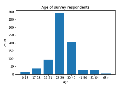
Unsurprisingly, for an internet community, the most populous age category was 22-29 year olds (note that age categories were not of equal range!) and the average age of respondents was approximately 29 years old. We do not have data solely from children here, although young people are certainly well represented in the data.
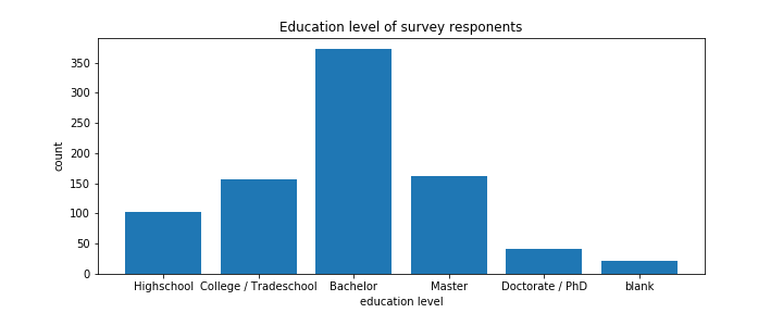
This is a well-educated bunch of travellers. The difference between "College" and "Bachelor" is not clear to me, but with the inclusion of "Tradeschool" I suppose there is a distinction being made between those who completed degrees and those who dropped out and possibly between level of educational institution attended.
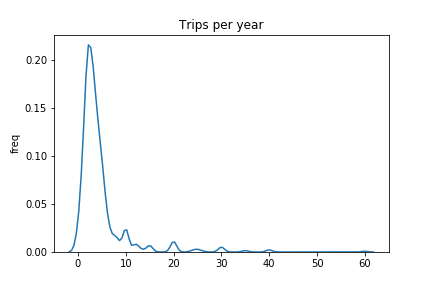
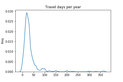
This is called a kernel density plot, you can think of it as a representation of the relative frequency of values. We can see that most respondents went for about three trips each year. There are a few people going for so many trips that they decided to round their response to 30 or 40 rather than figure out an exact number. There is a similar phenomenon with the days spent travelling each year (see below).
Now we get to the fun open-ended questions. I chose three for further visualization: "In 10 words or less, what is your best travel tip?", "What motivates you to travel?" and "What is the one thing you recommend people have to do/see before they die?"
For each question, I ran analyzed response sentiment, calculating the polarity (defined as negative to positive on a -1 to 1 scale) and subjectivity (defined as subjective to objective on a 0 to 1 scale). Sentiment values are presented in a polar coordinate bar chart with subjectivity encoded by height and polarity double encoded by degree and color. Hovering over a bar reveals the sentiment scores and the original response.
With these sentiment scores we can easily trace the algorithm's logic from the assigned values. For example, judged as least polarizing are "Don't take checked in luggage if possible" (check and possible), "Be curious" (curious), and "Expect the Unexpected" (expected and unepected) in which the words being used in the analysis really jump out. My favorite artifact is the concentration of "Grand Canyon" responses at high subjectivity.
In addition to the sentiment, I ran an analysis called term frequency-inverse document frequency (TF-IDF). After removing stop words (words without semantic value such as "and", "so", "to"), we calculate the number of times each word appears in the data (term frequency). We than multiply by a measure of the meaningfulness of the word (inverse document frequency), which gives more weight to rare words. You can read more about TF-IDF here.
For each question I have shown the twenty highest TF-IDF values. Since TF-IDF is a relative measure (informed by the context of the population it is drawn from), the exact value is not as meaningful as the comparison between words. However, you can look at exact values by hovering over each bar. I think the most interesting features are the prevalence of "culture" and "new" in responses for travel motivation and the lack of dominant words in the responses for things to do before you die.